Case Study

Case Study

Case Study

Sapphire 2026

Joule visual system

Joule visual system

Details

Scope

Accessibility

Localization

Visual Framework

Templates

Type

UI/UX Design

Collaboration

Art Director, Digital Experience designers, developer

Timeline

March 2026–ongoing

SAPPHIRE is SAP’s largest annual tech conference. For the 2026 launch, SAP.com needed to reflect a new direction centered on Joule and the autonomous enterprise.

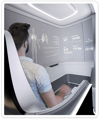
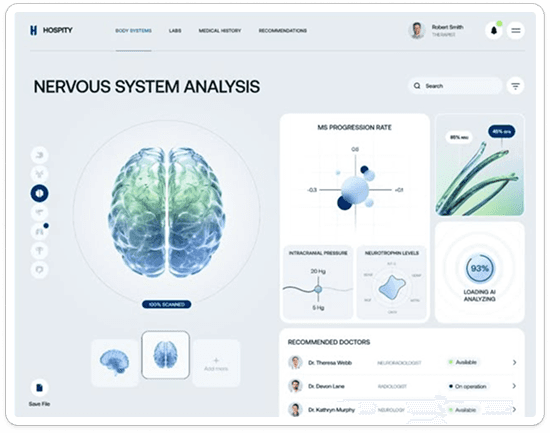
Sanvia is a health knowledge platform that uses AI to offer clear, personalized answers to your health questions without privacy concerns.

Working alongside my art director, I co-developed the visual framework that brought this direction to the website. We defined design principles, created reusable templates, and supported their application across 17+ different product areas and 450+ pages.

Sanvia is a health knowledge platform that uses AI to offer clear, personalized answers to your health questions without privacy concerns.

[01]

challenge

Hundreds of pages.
Different product stories.
One shared visual language.

As SAP’s products evolved, its web experience needed to evolve with them. SAPPHIRE 2026 gave us an opportunity to introduce a fresh visual direction centered on AI.

We needed a framework that could accommodate different content while giving designers clear rules to work from.

The project covered 469 pages across 17+ topic areas. High-priority pages were delivered for SAPPHIRE, while remaining pages continued through rollout.


The framework supported approximately 20 UX designers through shared principles, templates, and page examples. Throughout implementation, I contributed design guidance, custom assets, and direct page support alongside my art director.

[02]

[02]

design requirements

What the system
needed to support

A recognizable visual direction across topic areas

Flexibility for different page types and product stories

Clear distinctions between AI capabilities and other content

Accessibility and localization needs

Practical implementation by a wider design team

Understanding the content
behind the visuals

The framework spanned Finance, Supply Chain, HR, Sustainability, Partners, and other areas. Each had its own content, stakeholders, and implementation needs.


My art director led working sessions with product experts, and I contributed across many of them. I used those conversations to understand which capabilities a page needed to communicate and translate complex product information into visual storytelling.


I also participated in regular check-ins with designers, web managers, and our developer to surface blockers and review implementation. For areas without embedded designers, I worked alongside my art director to create page designs and custom graphics directly.


These conversations shaped five requirements:

  • Maintain a recognizable direction across different product stories.

  • Give AI symbols and imagery a clear purpose.

  • Make the framework usable by designers working independently.

  • Account for accessibility, responsive behavior, and localization.

  • Keep designs practical to implement within the launch timeline.

[03]

solution

Art Direction

Key Findings
and Insights

Agentic glass

Shared rules for gradients and backgrounds connected those palettes to the wider site. I applied these treatments across page designs, using labels and page structure alongside color to communicate context.

Surveys and street interviews (18–60 years old)

Blur

Light Diffusion & Transparency

Layering

Color

SAP Blue remains our foundation, while Joule and Indigo have been elevated as the next evolution of the brand signaling the Autonomous Enterprise.

Secondary colors are still used, mainly as accents and in support of way finding.

Surveys and street interviews (18–60 years old)

Product UI

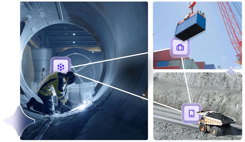
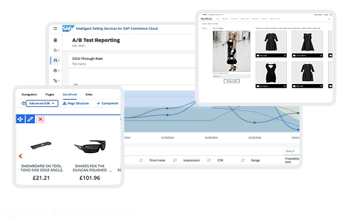
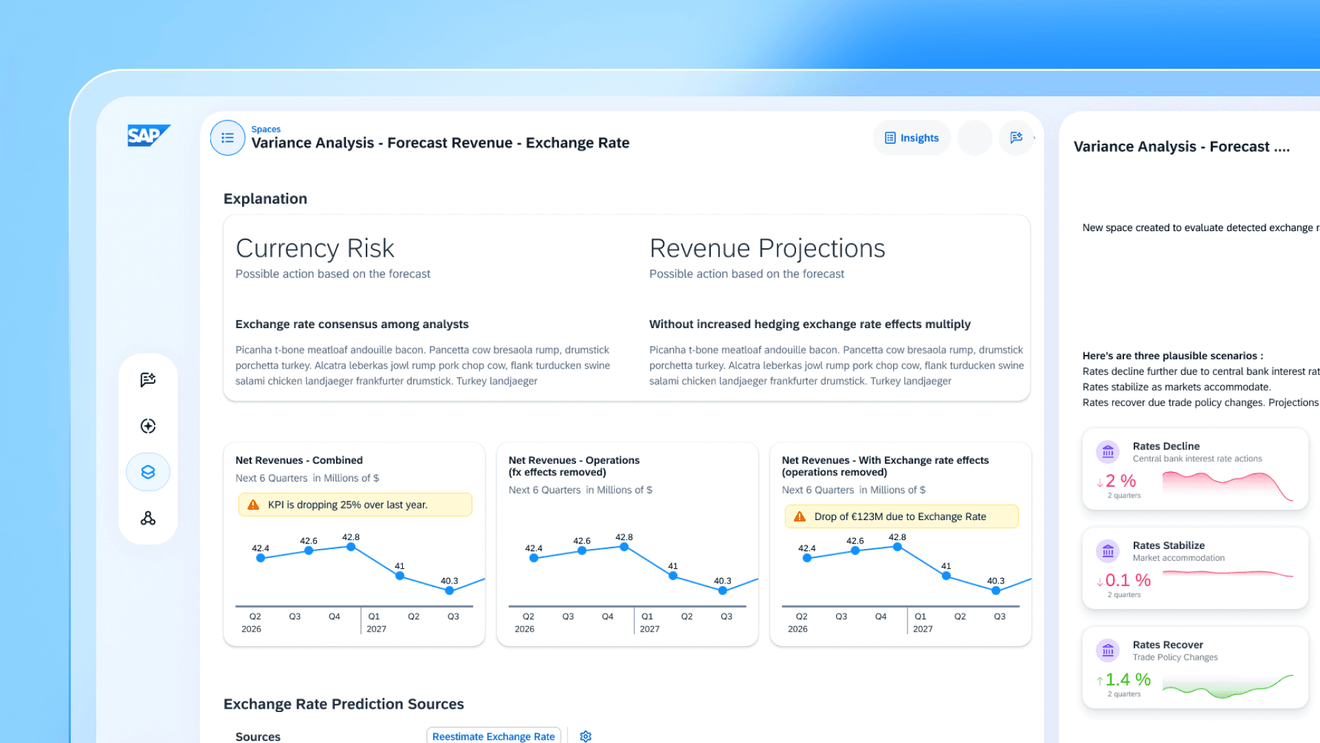
We’re leveraging more UI snippets where possible across image categories including, but not limited to:

  1. Key features

  2. Key capabilities

  3. Hero graphics

  4. Video thumbnails

  5. Product trials & tours


In addition to updating image containers with dimension and frost, products now lean into specific moments through the use of UI cutouts and highlights.

Surveys and street interviews (18–60 years old)

Key Features

Capabilities Section

Hero Graphics

Video Thumbnails

Product Trials & Tours

Hero

Our Heros convey complex topics using visual storytelling. Keeping clean simple headlines, along with layout and color, helps focus the user on the key message while not creating information overload.

Surveys and street interviews (18–60 years old)

For animated heroes, we worked directly with our developer during design and iteration. The motion helped explain interactions such as Joule responding to a query or an agent completing a workflow.


Together we worked on refining visual treatments, reviewing responsive behavior, and preparing alt text for animated assets. Collaboration with the developer also brought loading behavior, contrast, and motion alternatives into the design process.

L1 Topic Overview

Joule

Line of Business (LOBs)

Business AI Platform (BAIP)

Industries

L2 Topic Pages

Resources

To lean into our extended palette and graphic elements, the featured resources section got a facelift. And we’re not done yet. This mini design extension continues opening up to address additional resource types.

On the webpage, they are displayed in Universal Layout.

Surveys and street interviews (18–60 years old)

Types

Backgrounds

Web Page Color Pairings

Company logos

Customer stories and partner apps now incorporate relevant visual language to boost the industry connection.

Surveys and street interviews (18–60 years old)

Types

Localization

I accounted for translated copy when adapting hero designs and kept text separate from graphics where possible.

For custom graphics that needed localization, I built a Figma-to-PowerPoint plugin. It allowed non-designer teams to adapt assets in a familiar tool. I also helped document the localization and developer handoff process.

This gave teams a way to work with delivered assets without relying on the design team for every language adaptation.


How might we utilize the gaps in existing solutions to make Sanvia stand out?

[04]

design process

Design and Pivot

Early

Moodboard

Branding

Logo

Inspired by the Latin roots of "san" for health and "via" for path, Sanvia was named to represent where health meets your personal pathway.


This was represented in our logo, showing a path shaped into the letterform S.

Early Iterations

Early Iterations

In today's world, where people are often wary of AI, it’s crucial that design choices foster trust.

My approach focuses on creating an empathetic connection between Sanvia and the user, ensuring the experience feels approachable, safe, and human-centered.

Early Concepts

Our early builds emphasized personalization and resourcefulness. This was reflected in a light mode that emphasized key words like educational and trustworthy.

Usability Testing

Our team continued conducting interviews showcasing our low-fidelity wireframes and initial developmental team prototypes.


We completed 15 interviews, aimed at early evangelists and previous interview participants.


In our remaining sprints, we conducted a usability interview after we designed and implemented a new feature each week, completing 7 more interviews. 

Privacy by Design

After user interviews, we doubled down on de-identification and user control and realized our differentiator was privacy.


We built the platform around end-to-end encryption and full data ownership, ensuring users feel safe sharing sensitive health information.

As part of this focus on security, we shifted from a light mode to a dark mode interface. The darker palette was intentional: it visually reinforces privacy and safety while keeping the design minimal and intuitive, suggesting that health should be easy to navigate.

Branding

Logo

Inspired by the Latin roots of "san" for health and "via" for path, Sanvia was named to represent where health meets your personal pathway.


This was represented in our logo, showing a path shaped into the letterform S.

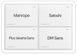
The typeface and colors balances clarity and emotion: a clean typeface ensures approachability, while a sleek, futuristic accent font signals modernity. Shades of blue convey trust and communication, paired with purple to evoke healing, wisdom, and consciousness.

This together creates a visual language that feels both modern and emotionally supportive in the midst of the overwhelming healthcare landscape.

[05]

problem-solving

Solution Features

Personalized search that uses your documents and health data

Context-aware AI tuned specifically for health questions

Explainable answers with the ability to ask clarifying follow-ups

Strict privacy with end-to-end encryption and user-controlled data

Onboarding Survey

Initial health profile

“Summarize my last
health checkup report.”

Document Upload

Lab results, doctor’s notes, diagnostic reports

Ask questions like “Summarize my last health checkup report” or “Is my sleep improving?” to receive responses based on uploaded data

Personalized Profile & Wearable Integration

Optimized contextual response and connect health tracking platforms to pull in relevant metrics like sleep and activity

Medical Chat History

Revisit past chats to integrate and upload updated medical information

Medical Chat History

Revisit past chats to integrate and upload updated medical information

Medical Bibliography

Check the original sources of the information provided

Landing

Landing

Chat Interface

Chat Interface

[05]

problem-solving

Solution Features

Personalized search that uses your documents and health data

Context-aware AI tuned specifically for health questions

Explainable answers with the ability to ask clarifying follow-ups

Strict privacy with end-to-end encryption and user-controlled data

Onboarding Survey

Initial health profile

“Summarize my last
health checkup report.”

Document Upload

Lab results, doctor’s notes, diagnostic reports

Ask questions like “Summarize my last health checkup report” or “Is my sleep improving?” to receive responses based on uploaded data

Personalized Profile & Wearable Integration

Optimized contextual response and connect health tracking platforms to pull in relevant metrics like sleep and activity

Medical Chat History

Revisit past chats to integrate and upload updated medical information

Medical Bibliography

Check the original sources of the information provided

Landing

Landing

Chat Interface

Chat Interface

Let's create
together ☻

©2025 All Rights Reserved

Yewon Park Portfolio

Let's create
together ☻

©2025 All Rights Reserved

Yewon Park Portfolio

©2025 All Rights Reserved

Let's create
together ☻